Helping Sprouts Grow Better
Link: Helping Sprouts Grow Better
The SproutCore community continues to grow! Avi has setup a new blog documenting more tips and tricks. Add it to your RSS reader today!
Link: Helping Sprouts Grow Better
The SproutCore community continues to grow! Avi has setup a new blog documenting more tips and tricks. Add it to your RSS reader today!
If you need to plot charts and graphs, some folks in the community have put together a few frameworks that are just for you.
Flot Framework - For general graphs checkout the Flot integration by Bo Xiao
JSXGraph - For plotting and point charts by Stephen Bannasch
Screenshot: JSXGraph demo.
If you’ve had questions about how to try out greenhouse - now you can watch someone else do it first: Sproutcore Greenhouse Setup (by Jake Mallory)
Link: SproutCore Documentation / Todos 06-Building with Grails
Thanks to Cam MacRae, you can now learn how to write SproutCore apps with Grails as your back end! Pretty awesome.

Well, we have finally done it. At jsconf2010 on Sunday, Mike Ball and I introduced Greenhouse: a Graphical Interface Builder for building blazing fast native-style applications using SproutCore.
Development on Greenhouse started in earnest only a couple of months ago. Mike and I worked in it in only in our spare time, but we have it far enough along to share with the community as a developer preview in SproutCore’s current master branch.
The truth is, we waited a lot longer than most other projects to start on our interface builder. But we didn’t want to start until we could do it right. We wanted SproutCore to go officially 1.0. We needed the API to become stable because there is nothing worse than jumping the gun and delivering a half-baked designer with an API that changes underneath.
While this may be true, no one has really innovated in this space for 20 years. They all seem to look the same. Here is a small sample of them:
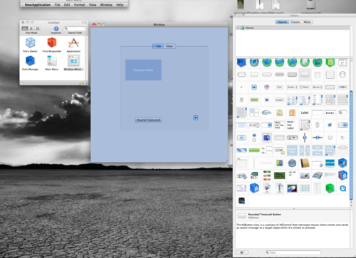
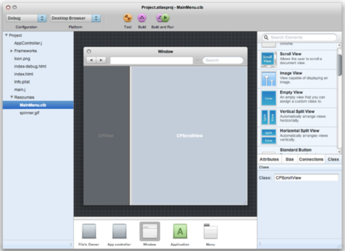
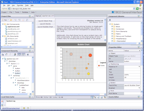
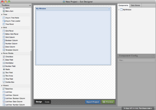
So these are good, but they all have the same problem.
If we are to build beautiful web applications, we can’t do it with a cluttered workspace. My wife does mosaics and she can’t really be creative unless she has a space to create in…I think it is the same for developers. We need a workspace for creativity, but these interfaces are cluttered with controls and only give you a small window to see your actual content!
So what can we innovate this space? How do we turn these cramped UIs in to a place where we can create some awesome web applications? Here are the steps that we took:
First, we cleaned up the interface. We move the list of components and inspectors to picker panes that can be torn off and docked in the traditional interface builders.
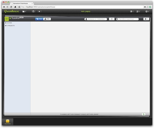
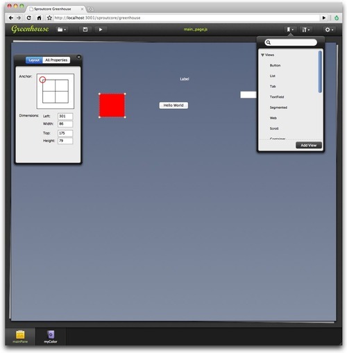
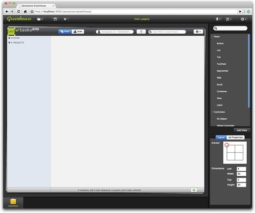
In this way, we maximize the workspace. We move as much as possible out of the way so you can focus on your content. This is also a true WYSIWYG editor.
We have been using this UI for awhile and, I can tell you, people who use it truly love it. This comes from our work with our current company’s product where customers can build emails and landing pages in the browser using a similar interface. We have been building a lot of real world experience in this space.
So we cleaned up the UI, but this isn’t the most important thing we could improve. The biggest improvement is…
Most production apps are built from custom views developed for the app. The problem is most interface builders can’t show you these custom views so they draw a blue box and leave it to your imagination.
We are all busy people. Most of us don’t have designers that can build custom mockups of views to show us what our UI will look like. Also, these designs change so much that is a major feat to keep up to date if you do have a designer. It is a hugh waste of time. So what you are forced to do is actually not have your custom views styled in your UI builder and it looks like this:

The SproutCore team decided the best way to solve this was to leverage the power of JavaScript. Rather than load a data file, Greenhouse actually loads your entire application in an iframe. Your actual application is loaded in a ‘suspended’ design state so that you can actually see your custom views as you have built them. They will update and look exactly like they would in the code.
This is an amazing time saver for you. It can help you actually build amazing user interfaces. This is what it looks like with a large application with a lot of custom views. It looks exactly like it does in real life as if you were using it!
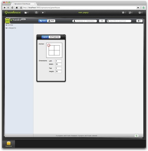
Oh, and one more thing: Greenhouse’s file format is actually Javascript built off of the 1.0 API. If you have a Sproutcore App that is built with SC.Pages, your pages will automatically load into Greenhouse will little to no effort.
Well, most interface builders cost lots of money. Like $100, $200 and even more. Some will even charge you for their beta releases.
We on the SproutCore Team believe that a UI designer is a fundamental tool for any framework that is worth it’s salt. So we have decided to build Greenhouse into SproutCore - entirely free. We want to give this away because its the right thing to do.
Well, that’s the easy part. Greenhouse is currently built directly into Sproutcore with some really easy steps to get it:
`git clone git://github.com/sproutit/sproutcore-abbot.git abbot
cd abbot
mkdir frameworks
cd frameworks
git clone git://github.com/sproutit/sproutcore.git
cd ../..`
And then from your Sproutcore project directory:
/abbot/bin/sc-server
Now all you have to do is open: http://localhost:4020/sproutcore/greenhouse and you should get the App Viewer:
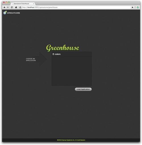
Note: If you use a custom build of SproutCore (something in frameworks/sproutcore), you will need to rebase to the Top-Of-Tree (TOT) to make sure you have all the code to run your application in Greenhouse.
We are trying to build the most beautiful and friendly interface builder UI out there. There are still a few bugs and lots of missing features as we have only been working on it for the last two months, but we are really excited about what the future holds for Greenhouse and Sproutcore.
Mike Ball and I are going to use the current version to build a mobile app for our company because we believe the best way to make a product is to use it and find the problems. We are really excited to see the new apps that people will build with this awesome FREE UI designer that offers a uncluttered design space with nary a blue box in sight!!
I also wanted to mention that the beauty of this design was due to the hard work of our awesome designer, Matt Grantham (@MattGrantham). You can see some of his other kick-ass work here.